






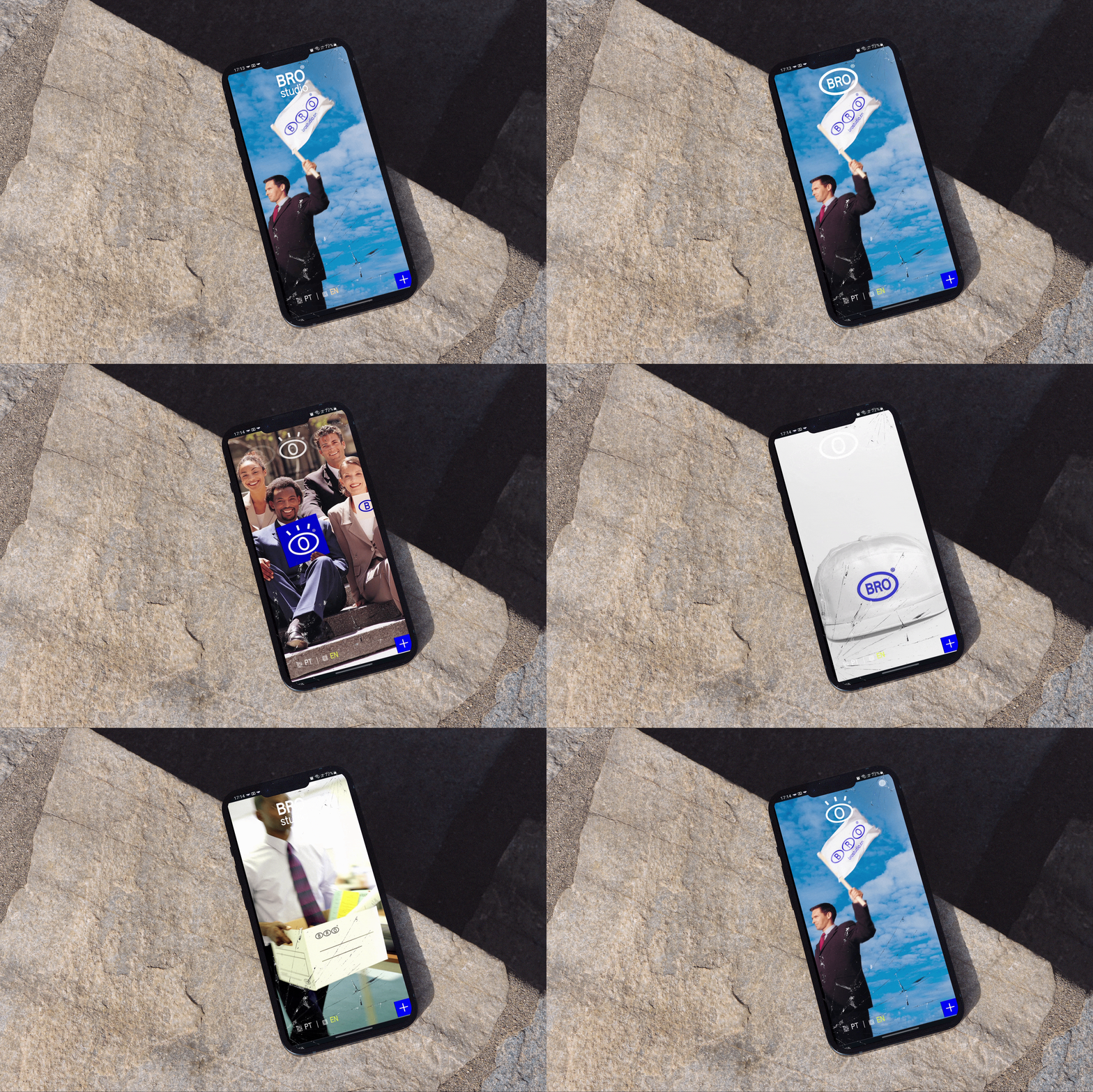
THE NEW WEBSITE
A really cool websiteTo portray the personality and perspective of the brand, the new website had to be nostalgic, humorous, and disruptive while still being attractive and fulfilling its basic function: showcasing the services offered, along with the portfolio, of course. A non-conventional platform (Cargo) was then employed, providing an intriguing level of freedom to the project and a finely tuned design touch. It's somewhat quirky, somewhat cool, somewhat different, somewhat old-fashioned, somewhat complex, somewhat contemporary.


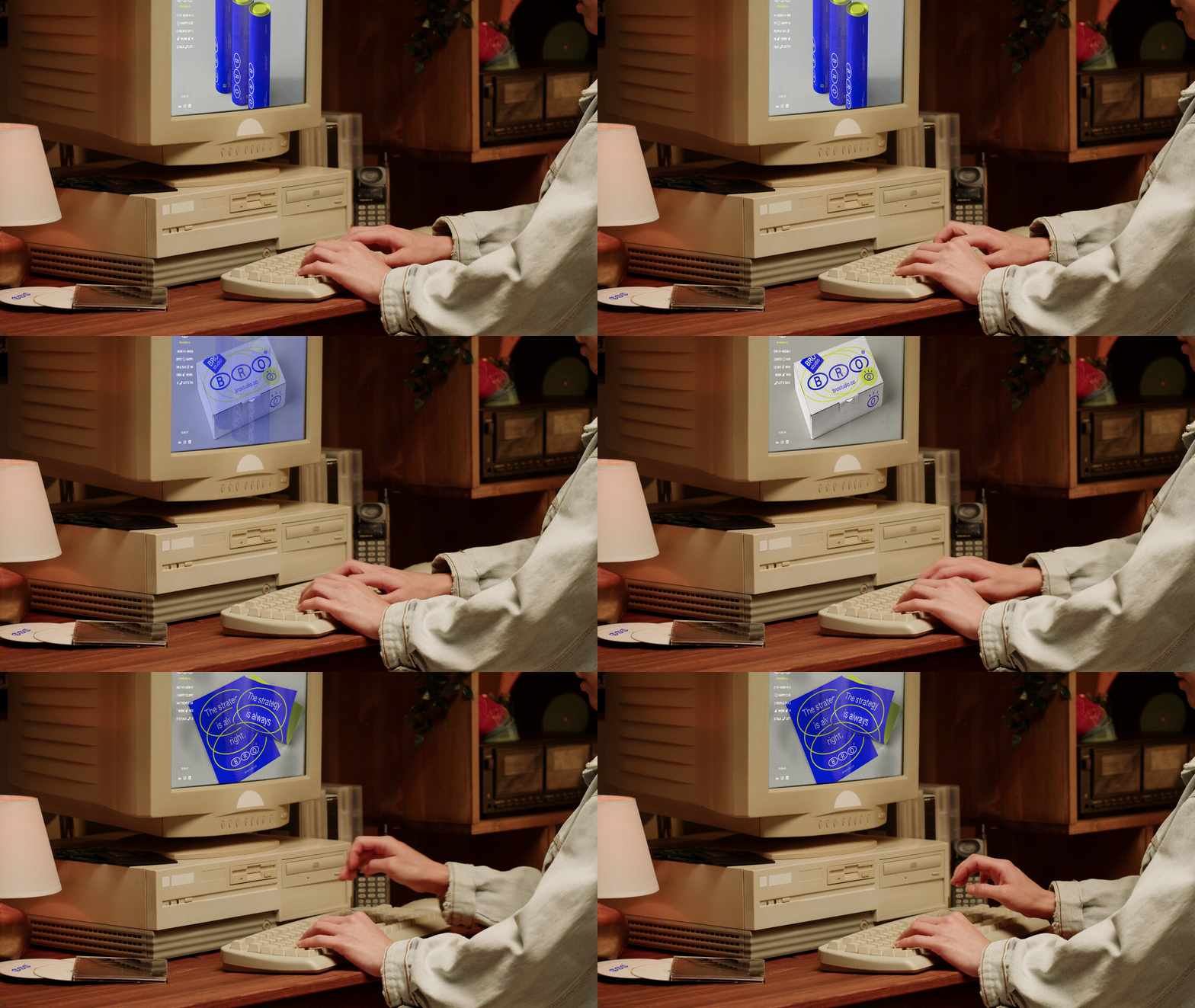
THE NEW WAY TO TALK
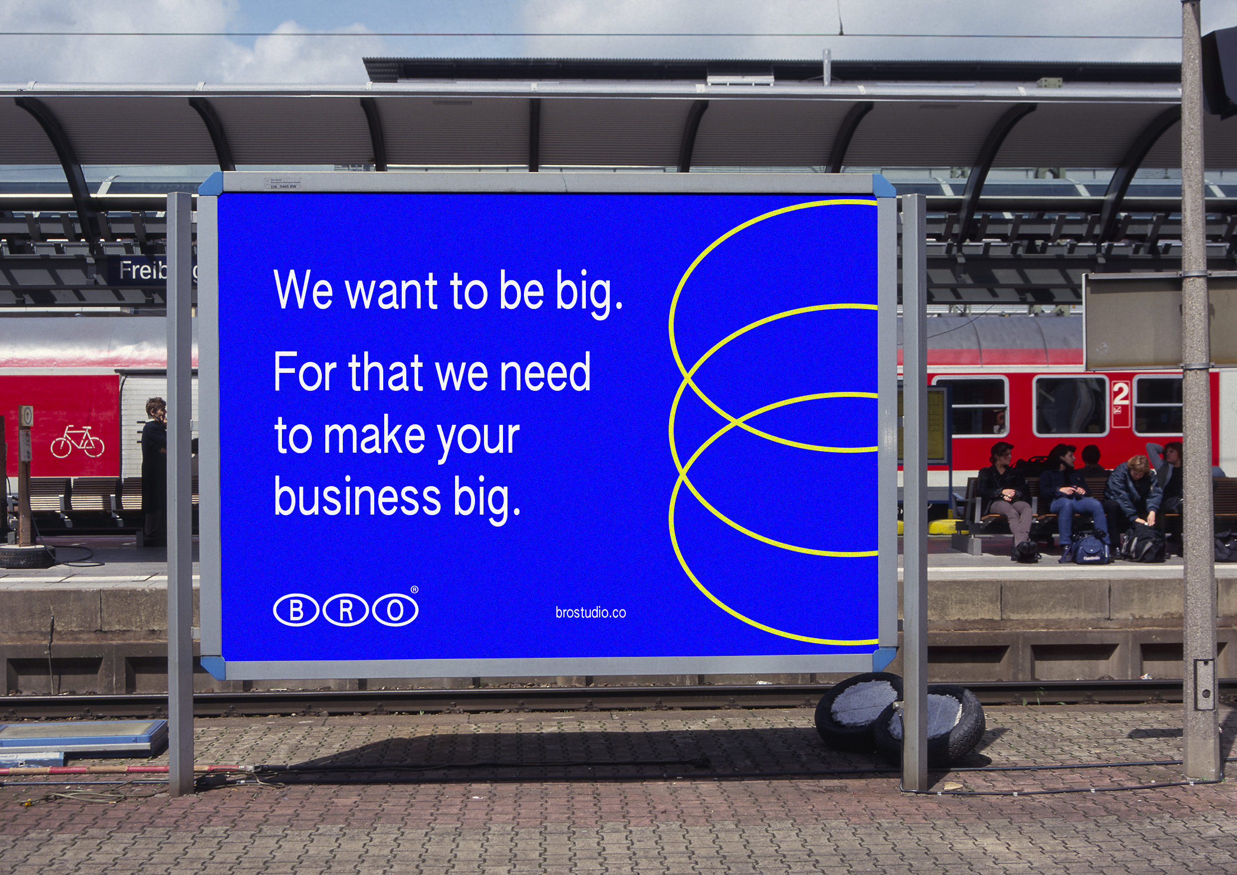
Let's chatBrands don't need to be boring – well, some do, that's true. But not this one. After all, future clients are human and should be treated as such. That's why the adopted tone of voice is very natural, light, often a bit ironic, sometimes even sarcastic. Any resemblance to human behavior is not mere coincidence. The brand's appropriation of these personality traits is much less about trying to make the brand human – because it isn't – and more about paying homage to the humans behind it, in design and business.




THE NEW FUTURE
We don't promise to behaveLooking to the past to understand the future. How things were done before the digital era and how to adapt that to artificial intelligences? This challenge is more embedded in contemporary design than ever. Is it time to update or revisit our old references? Or do both at the same time? It's these reflections that led the brand to take these visual paths that can fluctuate between the past and the future but in the present moment. But there is no attachment; the brand can and should adapt to its time, like someone changing their style every summer.


