

CONCEPT
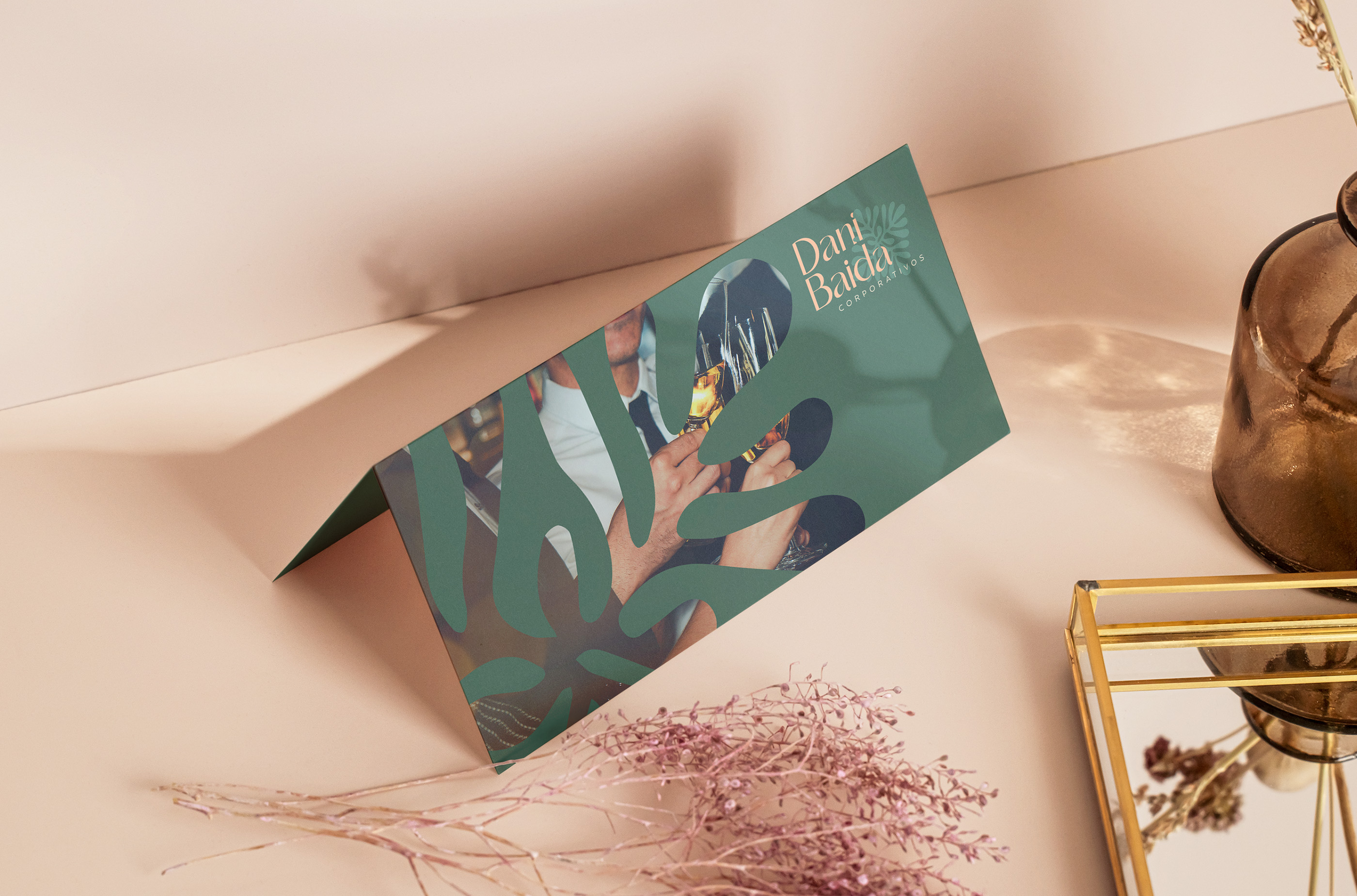
After researching and studying the events market, it becomes clear what people want when hiring consultancy services: care. Like a mother cares for her daughter. Like a leader cares for their team. Taking care of the hosts, taking care of the suppliers, and taking care of the details: that is the key message to be conveyed.

INSPIRATION & SYMBOLS
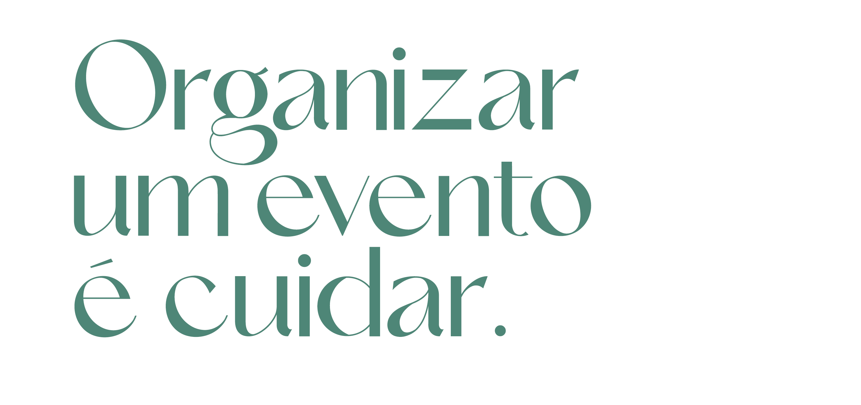
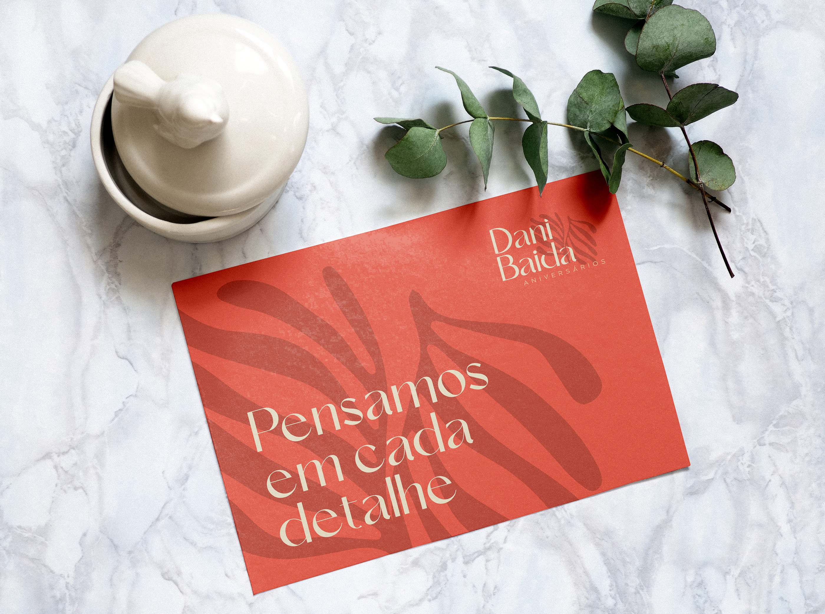
The starting point of inspiration is always the brand's truth. In the case of Dani Baida: "Organizing an event is caring." Thinking about every detail in each project is the fundamental role of an event consultancy. So why not bring those details into the brand?
It was then that the figure of Henri Matisse (1869-1954) emerged, a French artist known for his use of color and his fluid and original drawing style. Matisse saw the forms of nature as a means to explore color, light, and shadow, not just as an objective representation of reality. He often simplified and exaggerated natural forms in his works to create a sense of harmony and balance. Matisse's color palette is recognized for its vibrancy and luminosity.
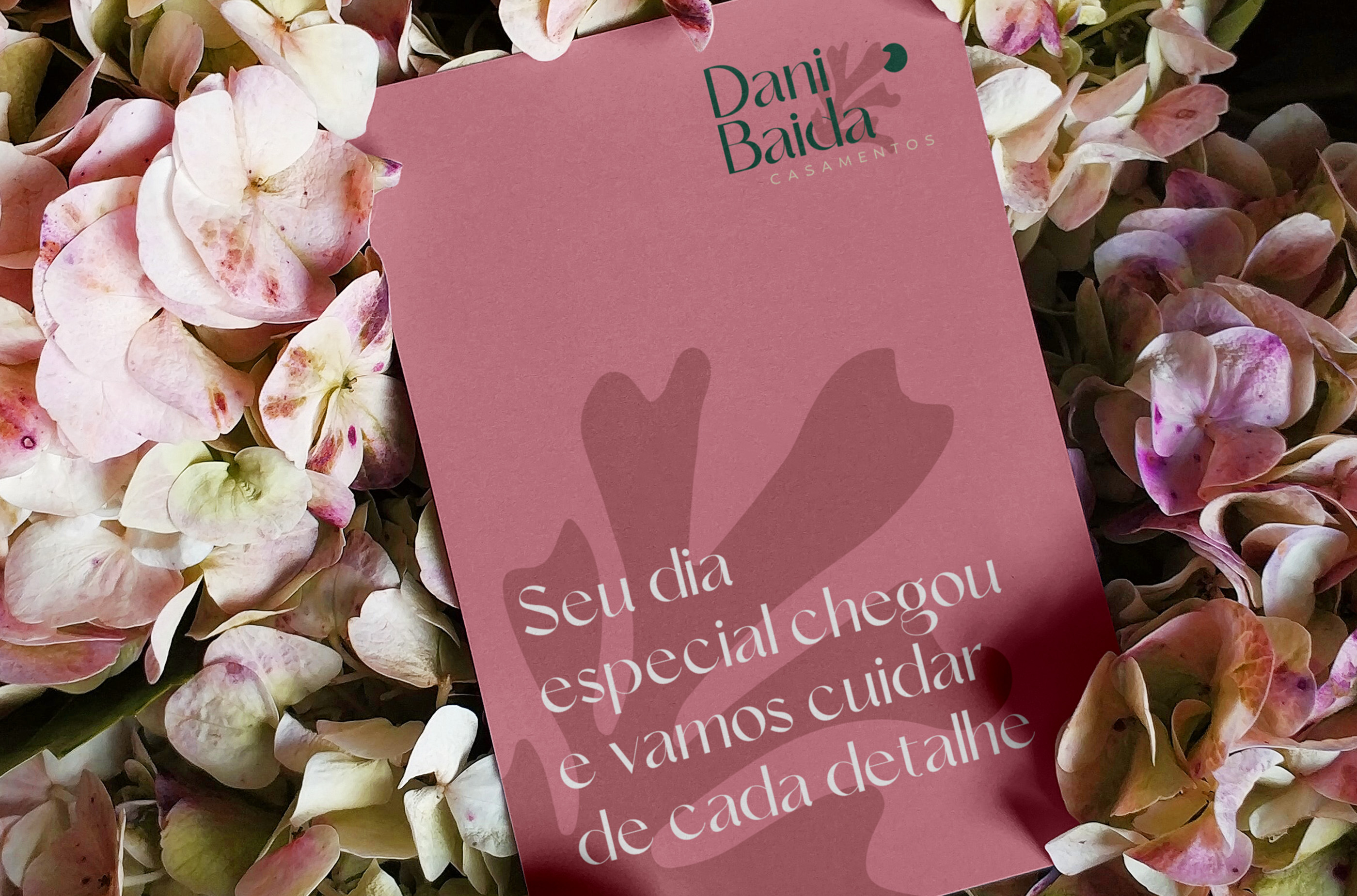
Taking care of an event means taking care of the smallest details. Specimens of plants, florals, and spices are some of these details that are always present in events, whether in a table arrangement or in the decoration of a dish.
Henri Matisse knew better than anyone how to abstract these images into simple, organic, vibrant, and unique forms. It is this same attention to detail that we want to convey with the brand. Following this reasoning, and inspired by Matisse's works, these four forms of plant specimens were abstracted.


COLORS
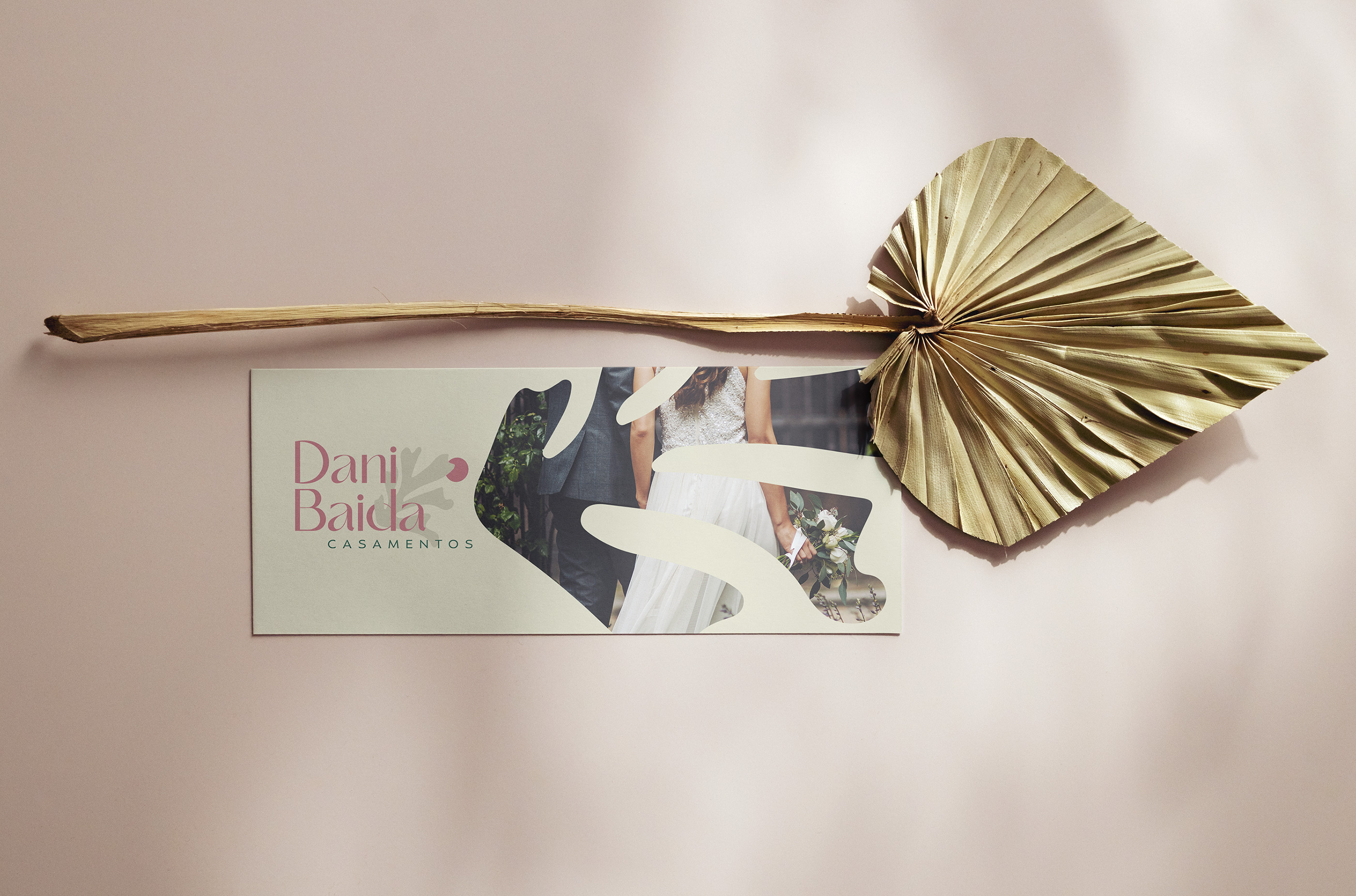
As seen in the brand strategy, there was a spectrum of colors that had not yet been explored by the market. Thus, the base of the primary colors was extracted.
The primary colors are vibrant but not overly saturated, bringing the tone of sophistication, maturity, and seriousness that the brand needed. However, they also bring a touch of fun and youthfulness. As for the secondary colors, they are slightly darkened to allow for combinations with interesting contrasts – such as day and night.



TYPOGRAPHY
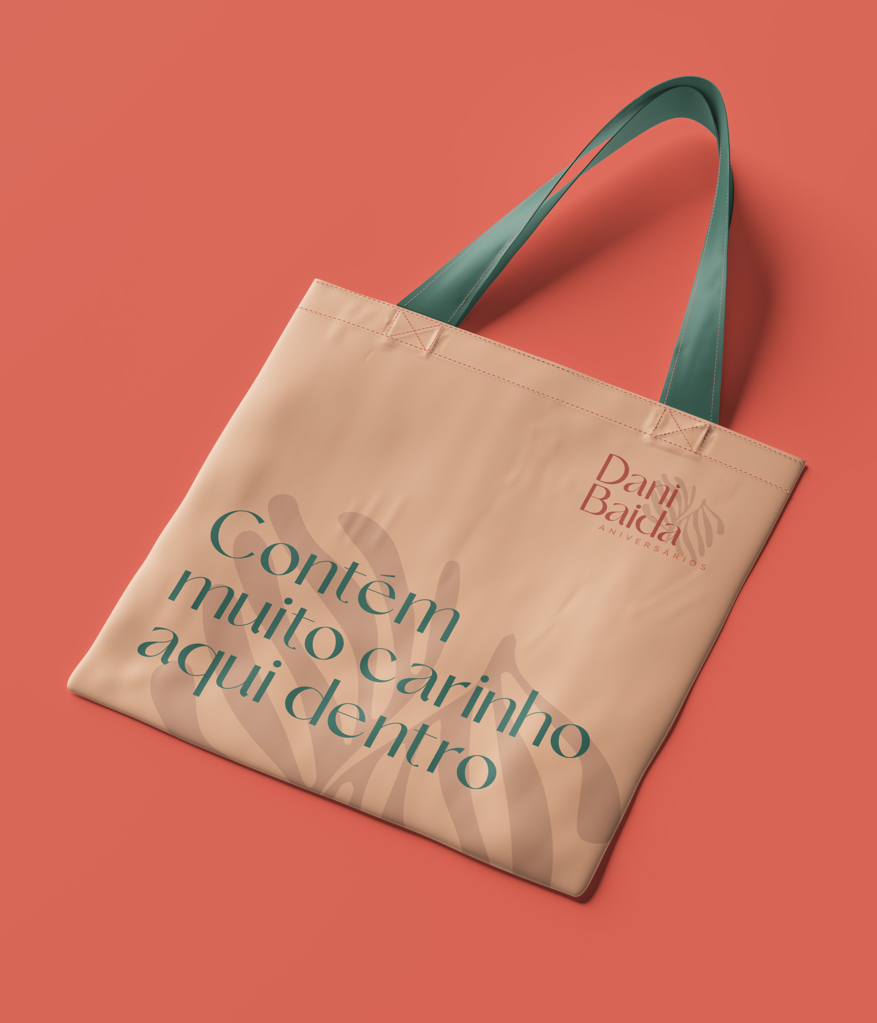
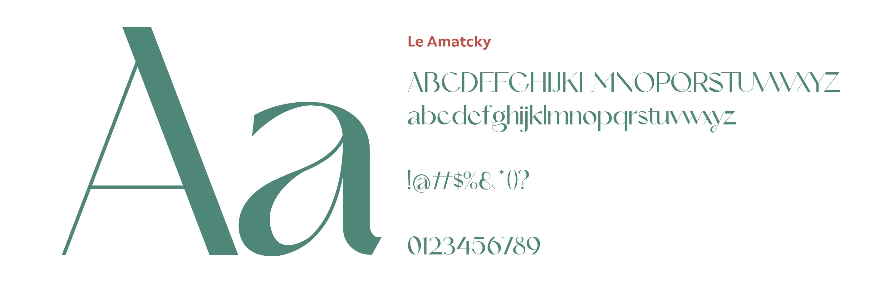
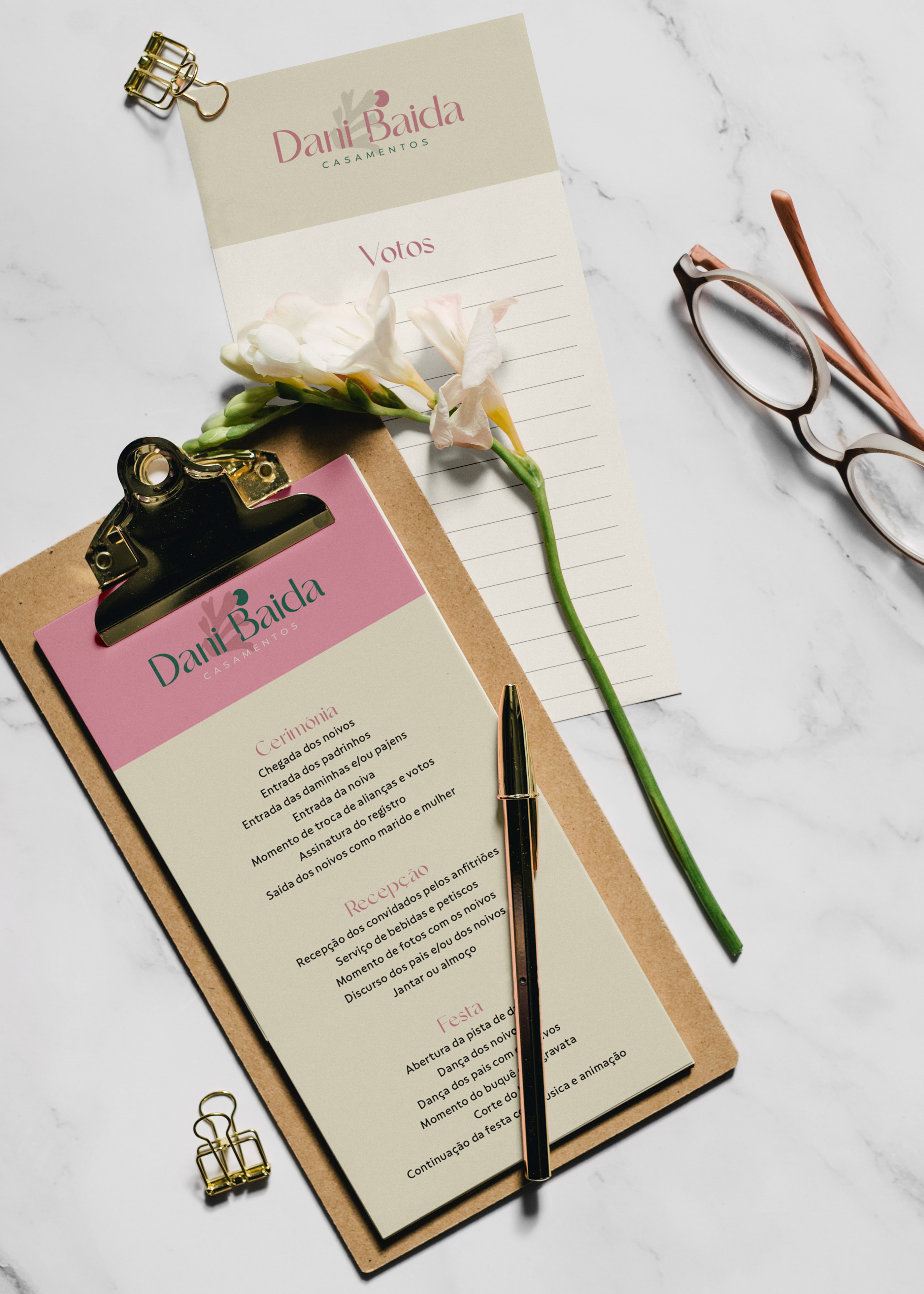
To differentiate itself from competitors and stand out in the events market, it was necessary to steer clear of some clichés. Handwritten letters, uppercase, and thin lines are the industry standard. Therefore, the typographic choice was the Le Amatcky font from the Hishand Studio foundry: refined, beautiful, contemporary, and slightly bold. Details such as the bowl of the lowercase 'a' and the tail of the 'g' bring a lot of personality to the font.
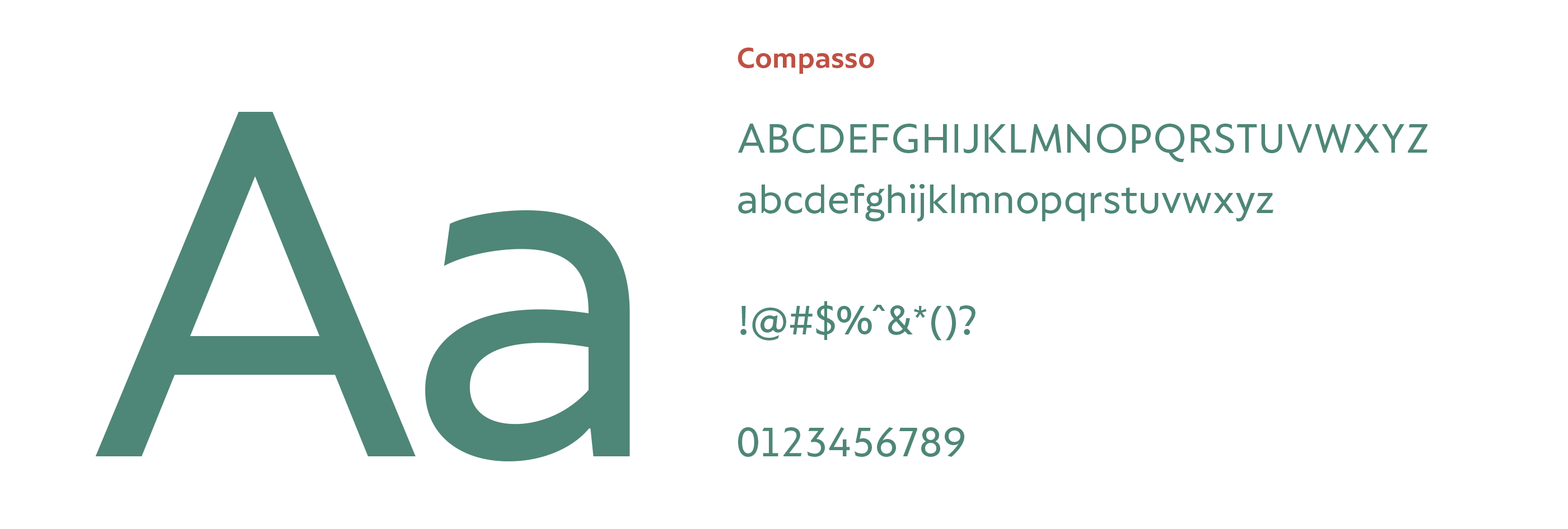
The supporting typography is part of the graphic universe defined to convey the perceptions and communication objectives outlined for the brand. Considering that the primary typography has a lot of personality and strength, the supporting typography needed to be neutral and easily legible. Therefore, the chosen family was Compasso, from Plau.
The supporting typography is part of the graphic universe defined to convey the perceptions and communication objectives outlined for the brand. Considering that the primary typography has a lot of personality and strength, the supporting typography needed to be neutral and easily legible. Therefore, the chosen family was Compasso, from Plau.



PHOTOGRAPHY
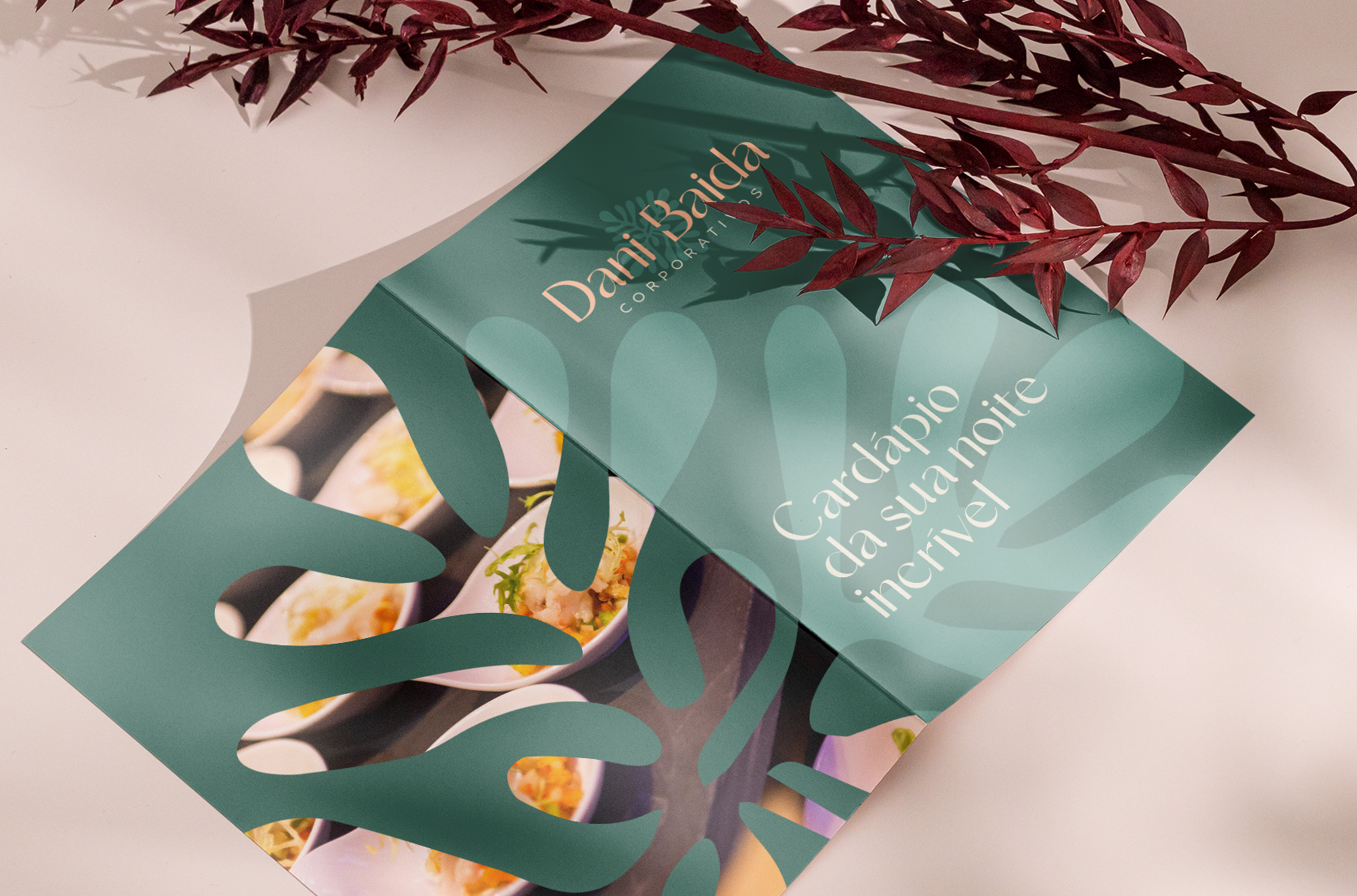
Following the concept that we take care of every detail of the events, the photographic language should reflect this idea, focusing on these details and preferably using macrophotography and close-up shots. Props, ornaments, fabrics, elements, spices... anything meticulous can be highlighted in the communication.
On the other hand, wide and open photos can distort the meaning and not convey the same idea. By highlighting, for example, the event space, there's a risk of favoring the image of the catering over the consultancy. The focus here is on the service offered and the attention to detail.


