PT
EXPERIMENTE+
Naming, Marca, Identidade Visual e Site
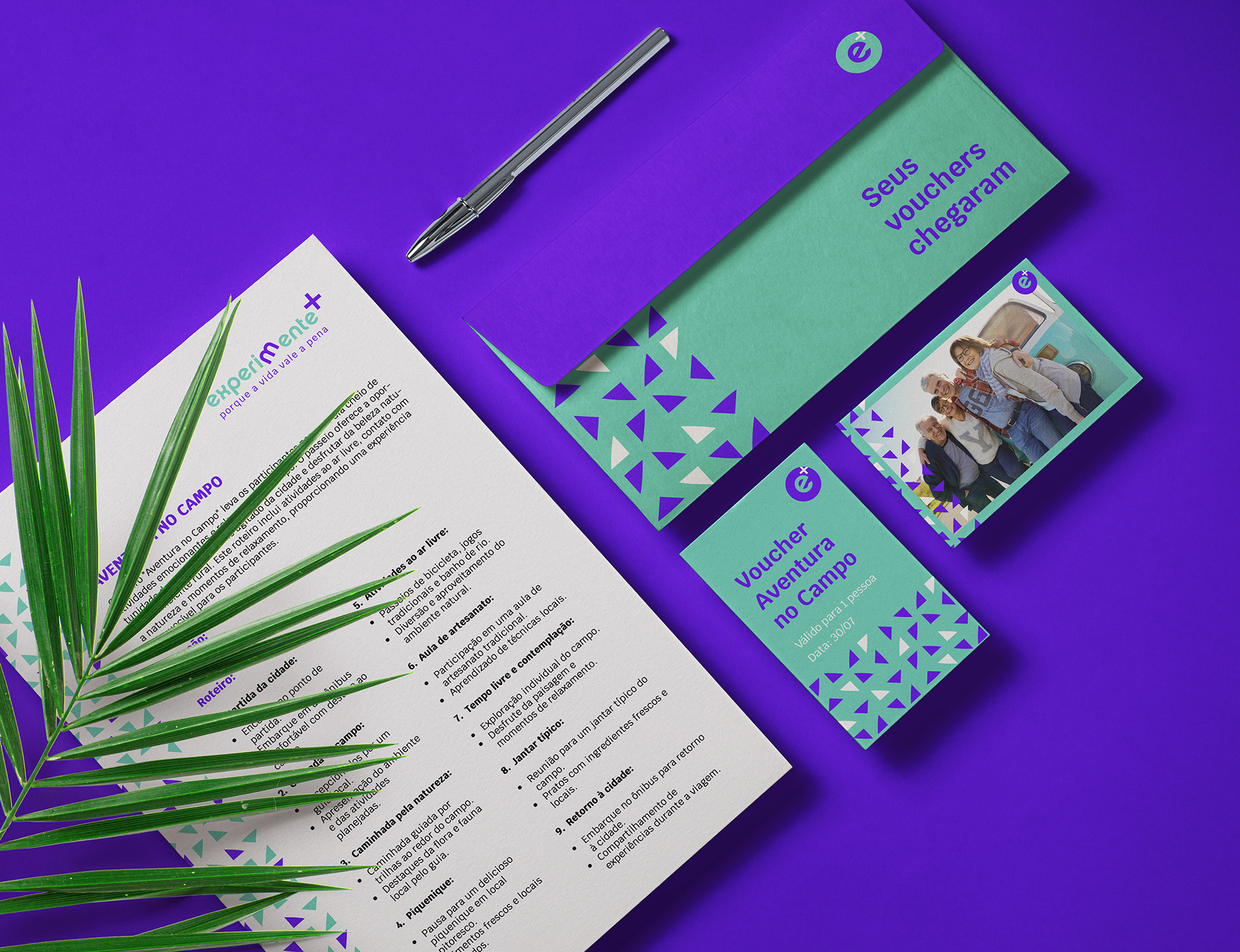
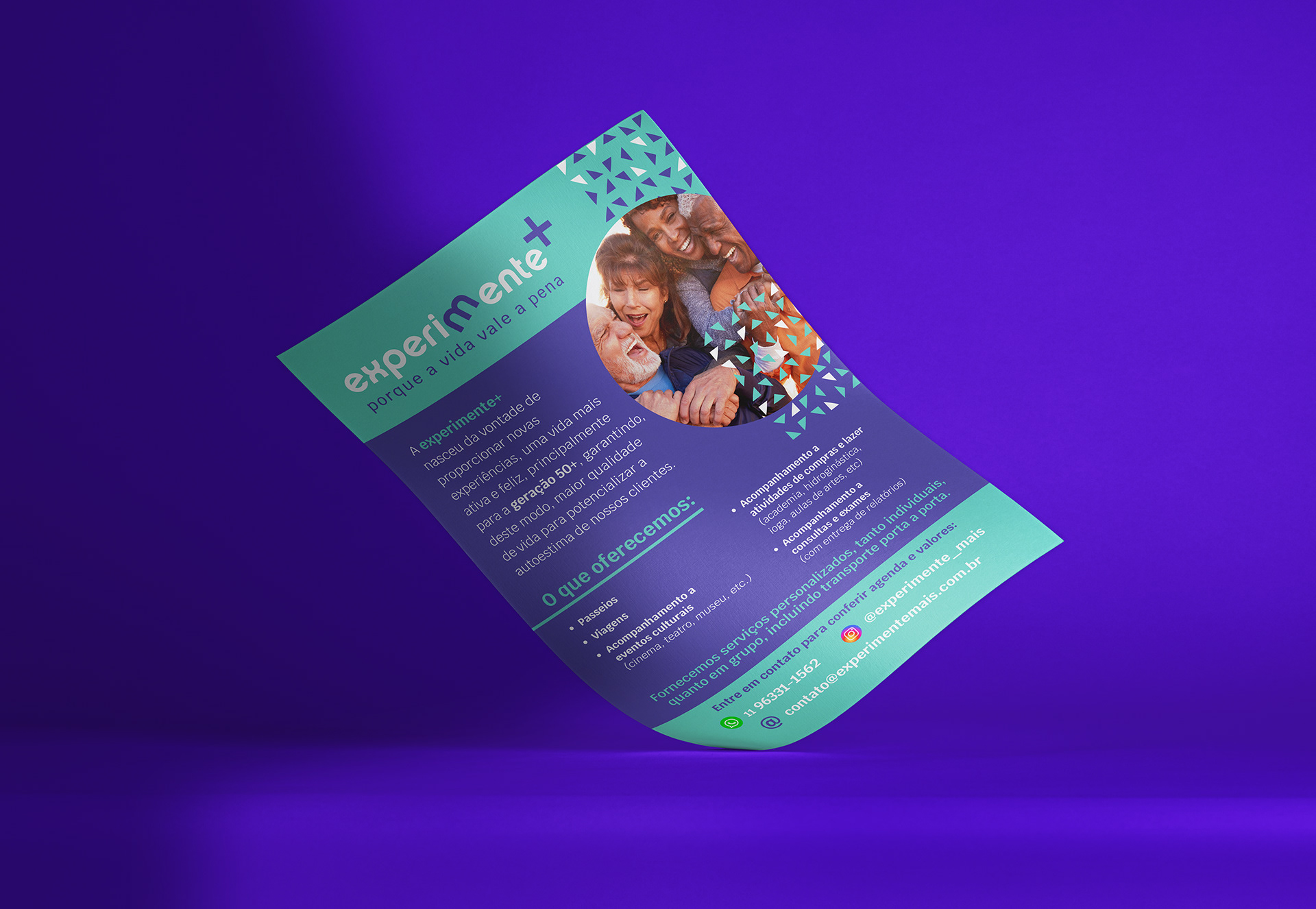
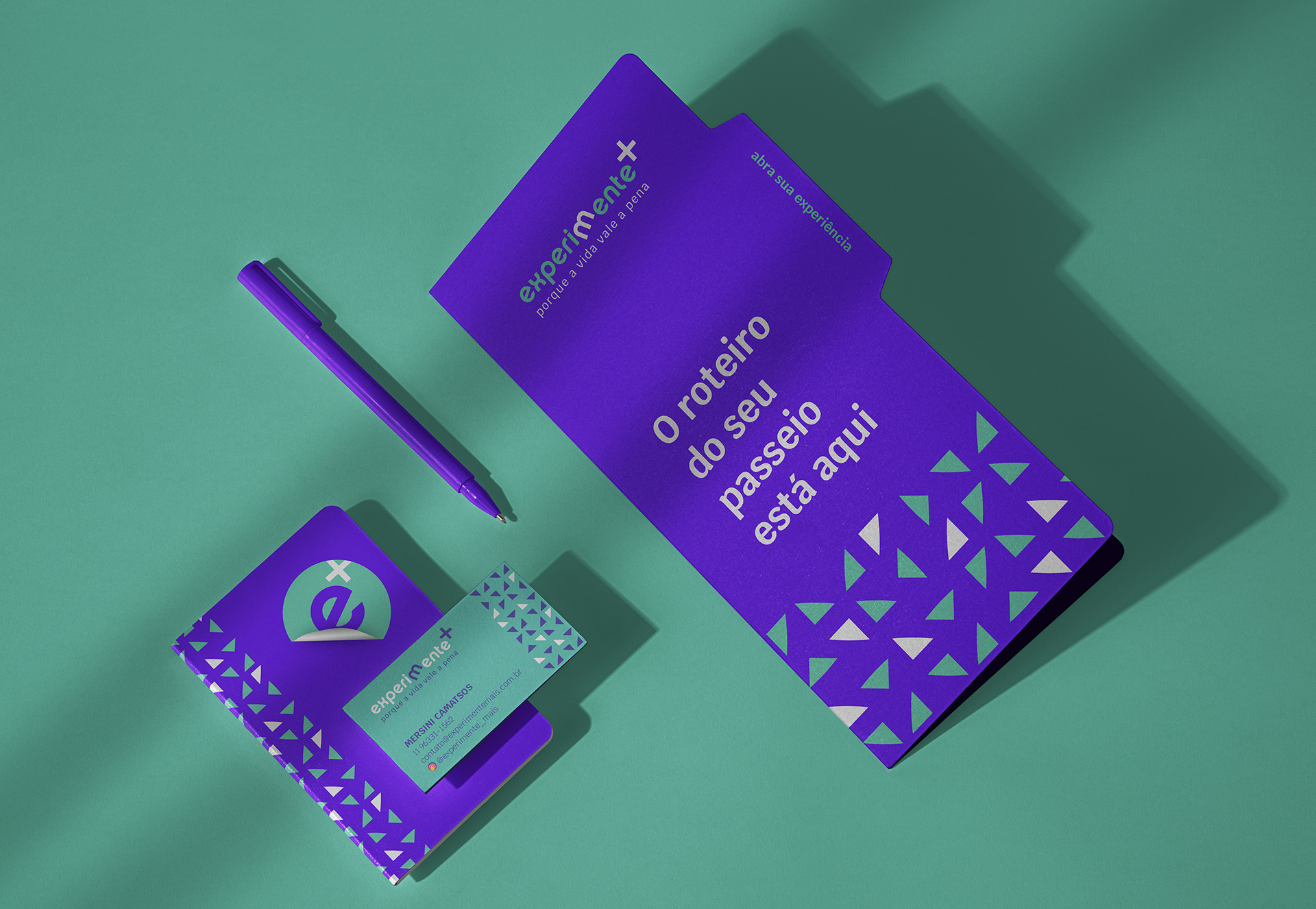
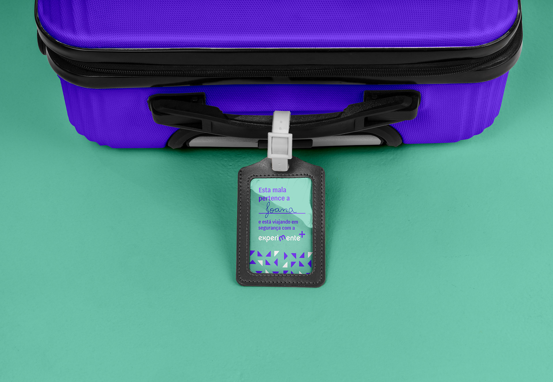
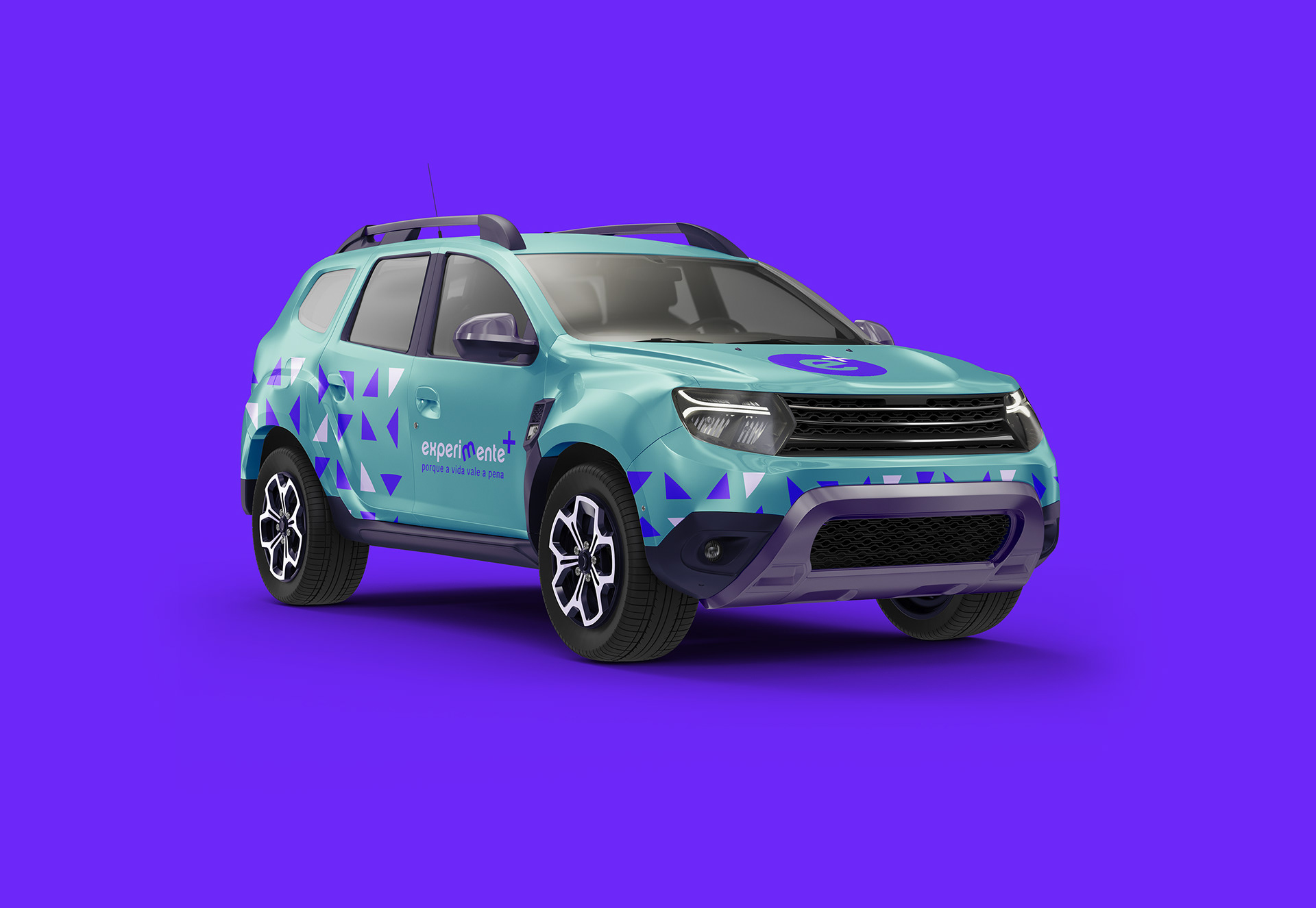
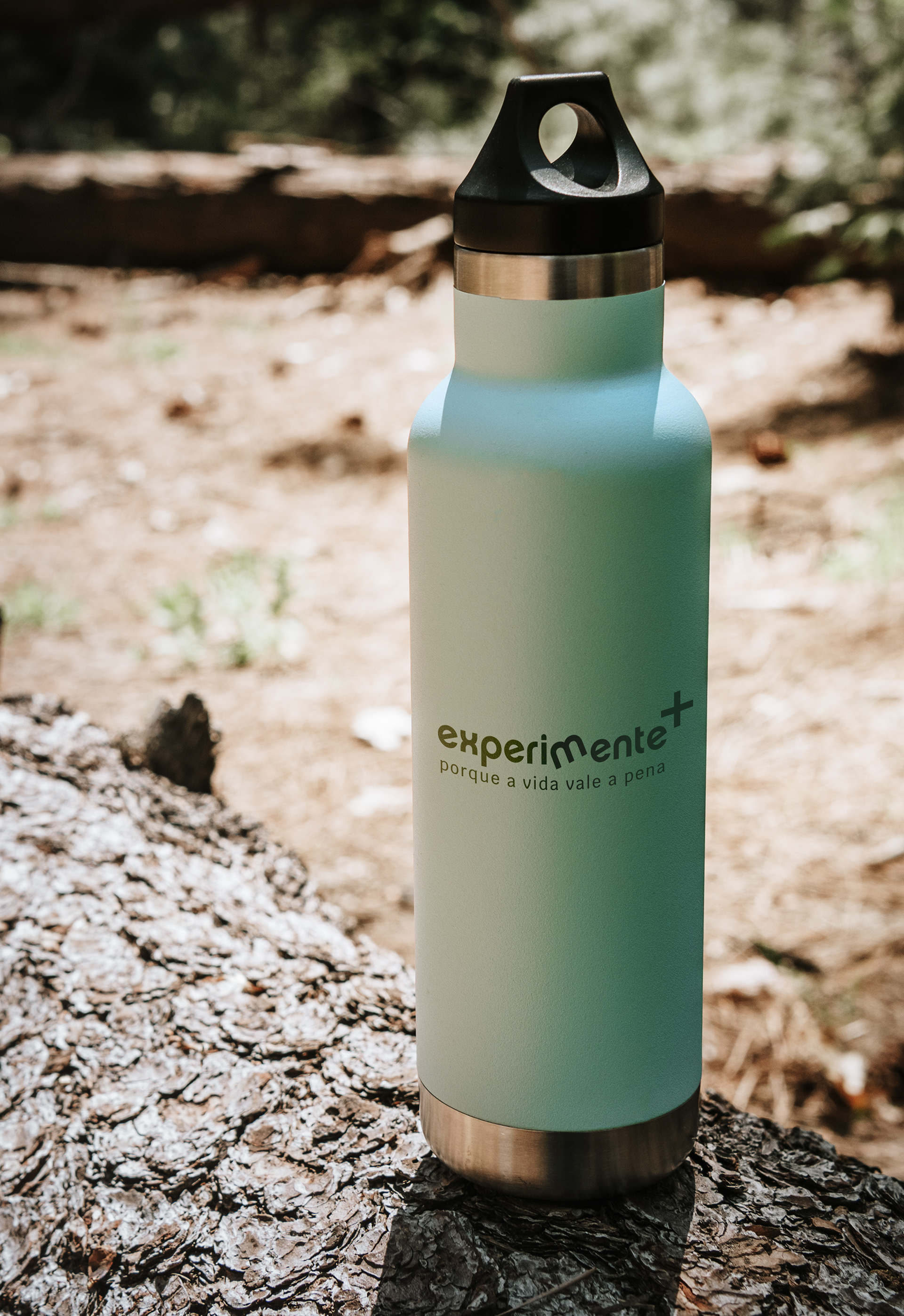
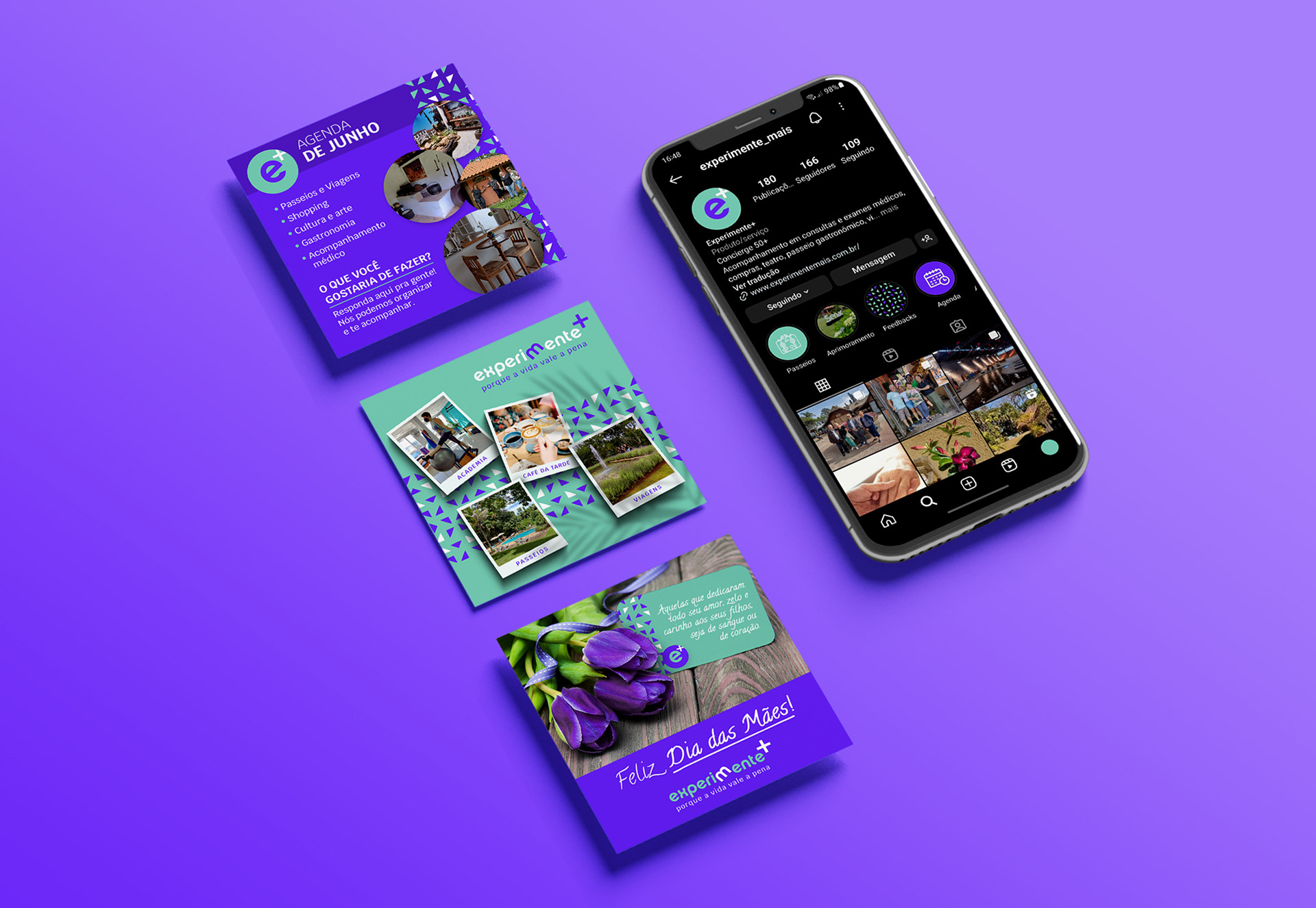
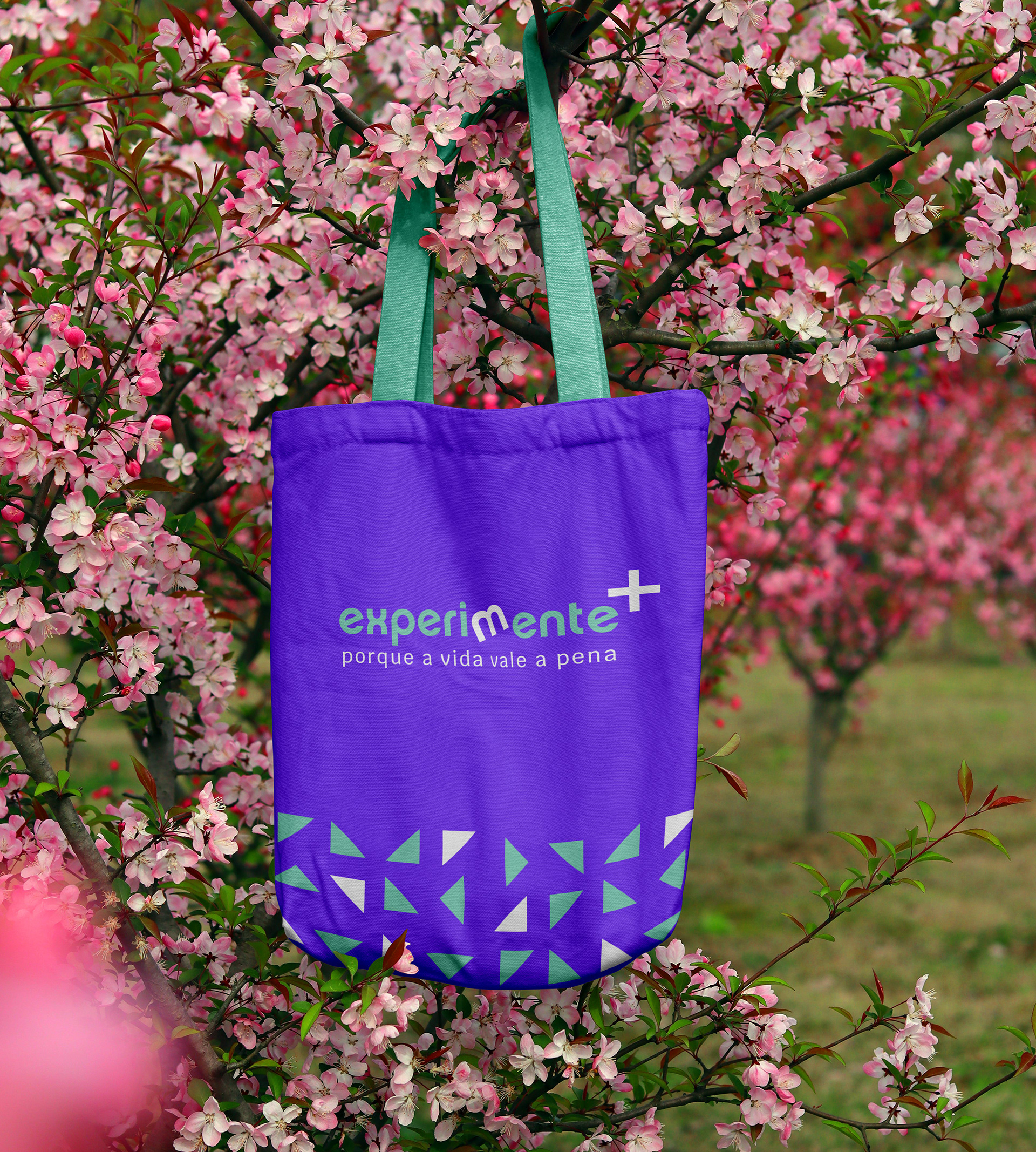
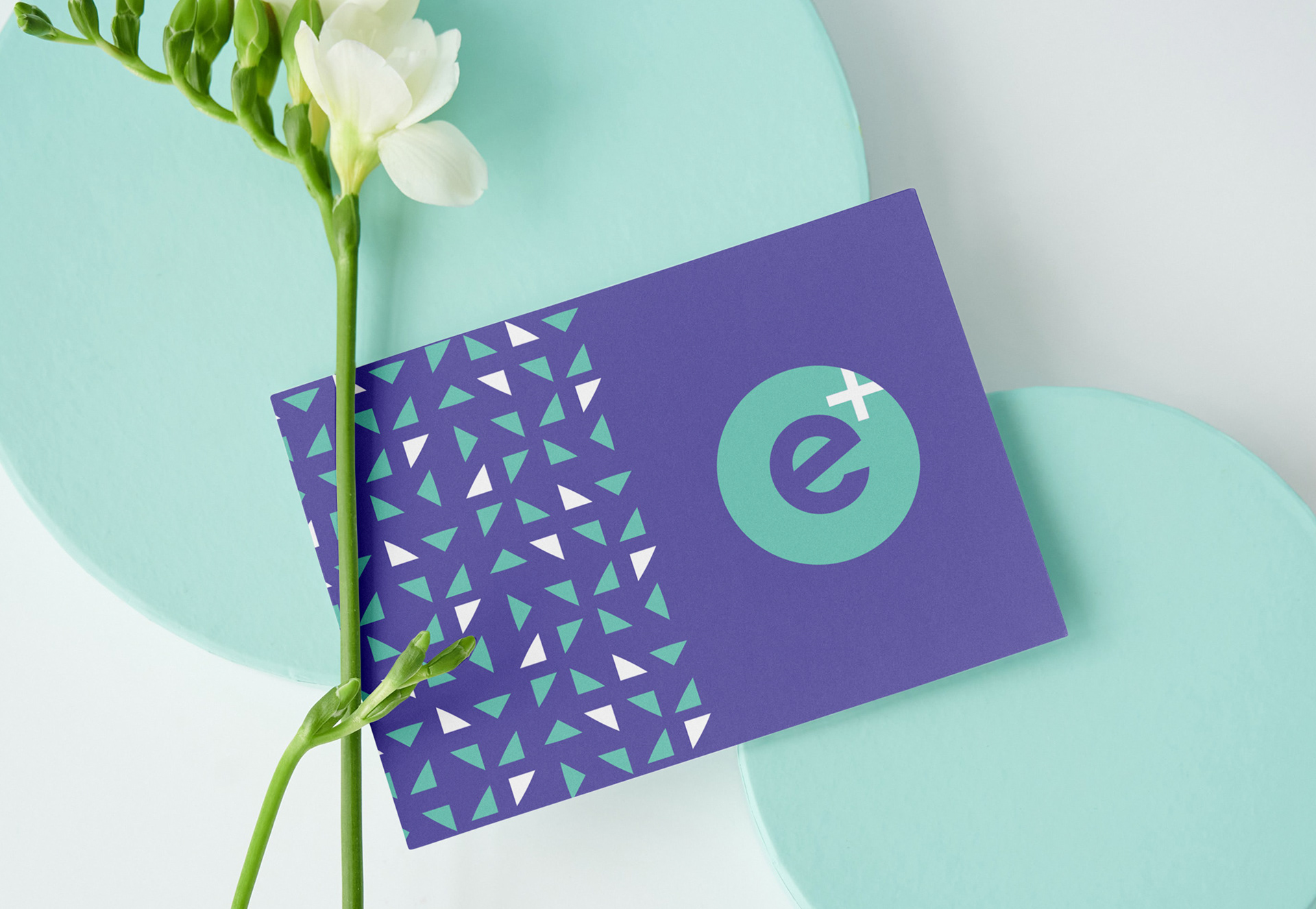
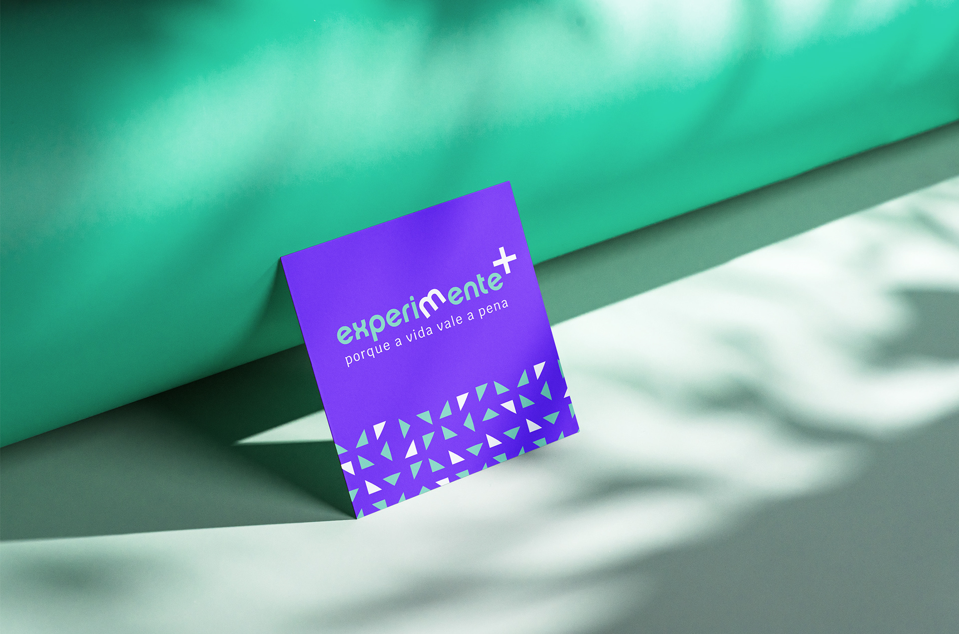
A Experimente+ presta um serviço diferente: acompanha pessoas 50+ tanto em passeios em viagens quanto em necessidades, como levar a uma consulta médica ou à fisioterapia. Eles organizam tudo, pegam o cliente e devolvem na porta de sua casa. Considerando a idade do público, tem de se ter uma cautela na forma de se comunicar – escolher bem as palavras, as cores, as imagens. E o desafio aqui para o estúdio era duplo: tivemos que criar o Nome da empresa e também a Identidade Visual. E teria que ser leve, fugir da ideia de maturidade engessada, chata, piegas. Então decidimos ousar, parecer jovem sem ser jovem, mostrar que a vida ainda vale a pena ser experimentada.
EN
EXPERIMENTE+
Naming, Brand, Visual Identity, and Website
Experimente+ offers a unique service: they accompany individuals aged 50+ on both travel excursions and everyday needs, such as taking them to a medical appointment or physical therapy. They take care of all the arrangements, picking up the client and dropping them off at their doorstep. Considering the age of the target audience, it's important to communicate with caution - carefully selecting words, colors, and images. The challenge for the studio was twofold: we had to create the company Name and Visual Identity. It had to be light, avoiding the notion of rigid, boring, or cheesy maturity. So, we decided to be bold, appear youthful without actually being young, and show that life is still worth experiencing.
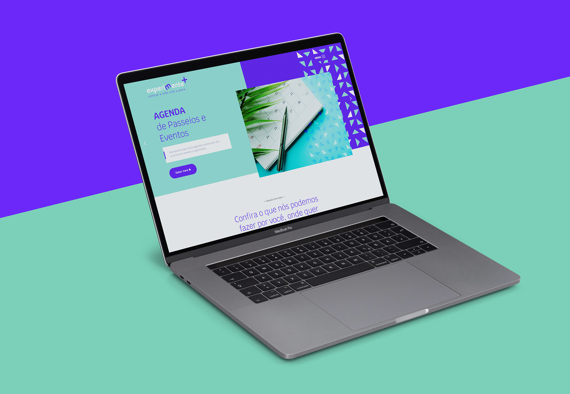
Website: www.experimentemais.com.br

PT
DEFINIÇÃO DO NOME (NAMING)
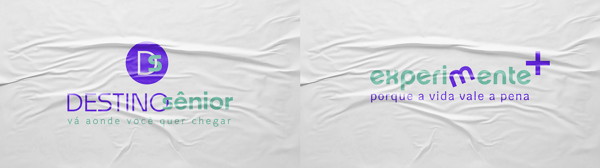
Após os estudos e definição da estratégia da marca, propusemos 2 nomes, taglines e logotipos.
Destino Sênior funcionava bem, mas era maduro e sério demais, apesar das cores escolhidas. E a ideia de “experimentar mais, afinal a vida ainda vale a pena” era matadora, convenhamos. Ela traduzia bem o que a marca queria transmitir: vamos curtir mais, passear mais, se cuidar mais, viver mais! Além, claro, de fazer alusão tanto à palavra “experiente” quanto “experimentar”, dois pontos importantíssimos para o público. E o “+” também remete à “50+”. Por isso essa foi a melhor escolha, certamente.
EN
NAMING
After conducting studies and defining the brand strategy, we proposed 2 names, taglines, and logos.
"Destino Sênior" worked well, but it was too mature and serious, despite the chosen colors. And the idea of "experiencing more because life is still worth it" was killer, let's admit it. It translated well what the brand wanted to convey: let's enjoy more, explore more, take better care, live more! Additionally, it alluded to both the word "experienced" and "to experiment," two crucial points for the target audience. The "+" symbol also refers to "50+." That's why it was the best choice, undoubtedly.